This should amount to a good starting point for using custom CSS code to style your Workflow forms.

An example of a standard ServiceDesk login form.

Using CSS, we’re able to style the form elements to our heart’s content.
There are some points that are integral to this endeavor —
- CSS is merged as text into an IncludeHTML component on the form
- the CSS must be wrapped in style tags in the merged value
- the element that is to be styled needs to have a “Theme Style” applied (custom is best)
- Javascript can be used to alter the CSS classes when events trigger
- additional classes can be defined in the CSS code beyond the translations needed for the “Theme Styles” (used for Javascript adjustments)
- pseudo-class code can be defined to handle events like :hover and :active without using Javascript or visibility controls
- variables can be merged into the CSS code, allowing for advanced styling of specific items in an array by index
- Workflow applies some style properties inline with the HTML (width, height, top, left, etc). This can be overruled by CSS classes if desired.
- important - my CSS skillset is bound to functionality, not convention; I’m not a web designer by trade, so thanks in advance for the constructive CSS criticism!

A button with no added styling.
To start, let’s create a simple stylesheet to control the look of a button. If a theme is loaded in, some pre-built styles will be available for our button; but let’s add a custom style.

A quick instructional illustration on how to add a custom theme style.
Then set the style for the button element.

Setting a theme style for a form element.
A quick way to find the resolved class name of the custom style we just added and applied is to debug the form with the class applied.

Using a modern web browser, elements can be right-clicked and inspected to view various values and properties.
So our “CustomButton” theme style we applied to the button element has resolved at runtime to the class name “cCustomButton”. This class can be referenced on a style sheet to style the elements to which that class is applied.
Let’s build a quick style sheet. I’m going to build the code in a Merge Text component.
<style>
.cCustomButton {
outline: none;
border: none;
border-radius: 6px;
background-color: #4682b4;
color: #ffffff;
font-weight: bold;
font-family: 'Courier New';
}
</style>
(IMPORTANT NOTE!! When performing a copy/paste of any text into an "Advanced Text Creator" such as the one used in the "Merge Text" component, always paste to a program like Notepad first to strip any styling from the clipboard data, then copy from the Notepad text to the Workflow text designer.) This is how it will look in your Merge Text component.

CSS code assembled into a Workflow variable using a Merge Text component.
Now that Merge Text output variable “FormCSS” needs to be applied to the form on which we want the elements styled. Drag an IncludeHTML component from the toolbox and place it anywhere on the form. Resize it to 20×20 to make it easier to work with, and then configure it as so:

This IncludeHTML component is configured to include from a text variable named “FormCSS”. It has been sized at 20×20 to be visible and grabbable, but not intrusive on the form designer.
Something to note with the IncludeHTML component – unless the component is told otherwise, it is selectable/focusable, and when focused, has an outline.

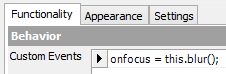
The quickest way to prevent this is to add a Custom Event to the IncludeHTMLcomponent that simply reads:
Event: onfocus
this.blur();
Now that the IncludeHTML component has been added, let’s debug and check the rendered element.

A button styled by CSS included in an IncludeHTML component on the form canvas.
Hopefully this will be a good starting point if you’re new to using CSS with Workflow. Find the rest of my Workflow blog at atmaworkflow.com.
-andrew