Intro
In response to folks requesting it, this is my solution for getting around the use of the grid component in forms. Since IE 11 and the grid component don't get along well and some workstations may only have IE 11, or have it set as the default browser, I had to find a way around using the grid component. I only have experience using this method with WF 7.5, but it should work just fine with 7.1.
The downside to this approach is that you can't do in-line editing like you could with a grid component set to edit, but it's very useful as a main listing page. You list the important identifying information about each item and link to another form that shows the full detail of the item. You can also allow editing on the detail page if editing is needed.
Attached to this page is a demonstration workflow package showing how this idea works in practice. All screen shots and examples are derived from this package.

Short Version (TLDR)
Don't use grids, use the "ListSelect" component instead. Above the ListSelect, put an html merge with a manually created table as your header row. In the item format of the ListSelect, create a table with a single row of whatever columns you need for your data. Add single or multiple outcomes from the ListSelect to suit your needs and use the outcome paths to go to detail pages, edit pages, delete confirmations, whatever.
Long Version
This longer explanation follows the path of the attached demo package. As prior workflow knowledge is expected, some steps are left out. Also, some HTML and CSS would be helpful if implementing this method.
For the demo, I chose to display something that should work in all environments, user info for users in the administrators group as listed in the Process Manager. This should be enough data to get you an idea of how this method works, but if you want to list more, simply change the name of the group in the first component. Other than the name of the group, I also changed the output variable name from the default. As good practice, I run the collection through a sort component just so it displays in an order you would expect on the next web form.

In the form, I have only 3 components: a close button (to end the process), an HTML merge, and a ListSelect. The HTML merge acts as the header row for our "table" of results display in the list select.
The HTML merge is going to be the basis for our table, so take your time with it and do it right. As it's the header row, you need to know what columns you want to display, how wide they should be, and what format the text should have. For this simple demonstration, I'm only displaying the user Display Name and Email Address. I have a third column to hold a clickable link, but more on that later.
After looking at my data and deciding on formatting (which is a lie, really, I just went with defaults, here), I made an HTML table per the source below. A couple of important points here. First, using CSS, I specified fixed column widths on the table data tags. Second, the table tag itself gets some styling; fixed layout to ensure the TD widths stay put and an overall width of the table (make sure you account for any border in your overall width).

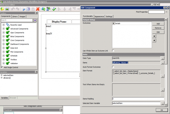
The ListSelect is the real meet of our simple form. Here we show the basic setup of it with our data type, collection, and outcome path.
A quick note about sizing and placement of your list select. Assuming you leave the overflow-y property to scroll, once you get enough data to scroll, a bar will appear on the right side. For this reason, you should size the list select component 15 pixels wider than your HTML merge. Note that this isn't the size of the tables inside these components, but of the component itself. Also, because the list select has left margin of a pixel or two, you may want to intentionally misalign the HTML merge and the list select so that the table and words line up better.
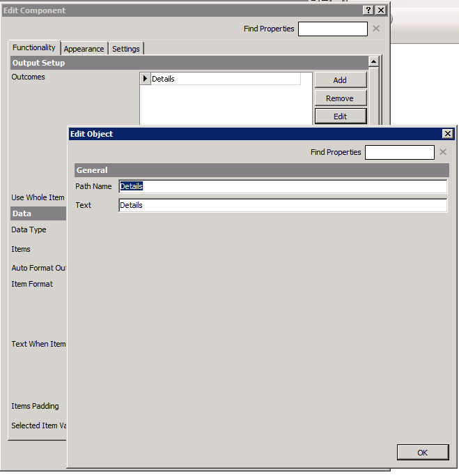
For this demo, I only created one outcome, or rather, renamed the default outcome. You can create multiple outcomes, though, depending on your needs. One for edit and one for delete would be a common example. Each outcome will populate a special variable to be used in the "Item Format" section of the list select component using the format of "_outcome_OUTCOMENAME_" where OUTCOMENAME is your outcome path name. The "Text" box is the text that will be displayed where the special variable is used and doesn't have to match your path name. These can be used anywhere in the formatting and don't have to be in a separate column if you don't want it to be.
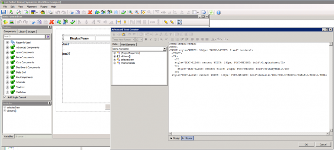
In "Item Format" we setup a how we want each row to be displayed. In this case, we are going to setup an HTML table that is nearly identical to the one from our HTML merge header row. In fact, you can copy and paste the source from the HTML merge into the item format source. If you do that, though, make sure you remove any text formatting like bold or centering that you don't want in your data rows.
Instead of the column heading names that the HTML merge uses in it's table, the item format table needs to be populated with actual data. The list select component populates another special variable while editing item format that we use to populate the data. This is the "_select_list_item_" variable. It's structure will be based on the data type specified on the list select "Functionality" tab. In this case, we delete the column name and drag over the corresponding data from _select_list_item_ variable.

Below you can see the finished source after replacing the column names with row data and removing some formatting. Because each row is getting its own HTML table element, there will be some white space between each row. To adjust for this, the main table element gets more CSS styling in the form of "Margin-bottom: -2px". Depending on any border options in your table, you may need to adjust that number of pixels up or down.

Conclusion
There you have it: a simple replacement for the grid component that will function as a row selector and works in any browser. By adjusting style you can make it appear how you want.